Chapter 5: Coherence of Seismic Body Waves: Figures
Figure 1
Geology and topography of Pinyon Flat from Wyatt [1982]. The heavy circle shows the radius of this seismic array.
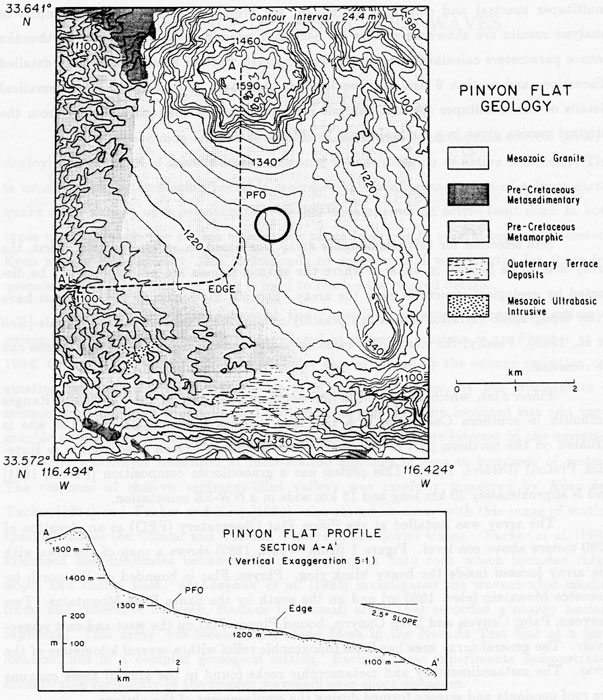
Figure 2
Location of magnitude 3 or greater events (circles) from the Caltech catalog for the years 1980-1984. The events which were recorded on this are marked with asterisks.
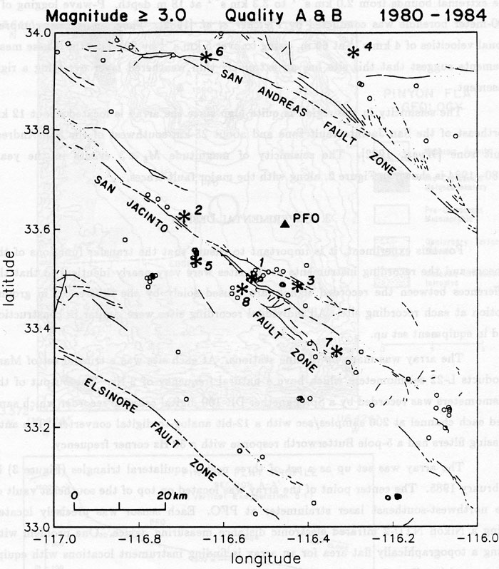
Figure 3
Layout of coherence array.
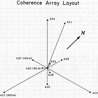
Figure 4
Seismograms recorded on the transverse component from event 8. The section of the seismograms used for the shear wave analysis is bounded by the dashed lines.
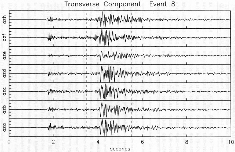
Figure 5
a. Mean log power spectrum with 95% confidence limits for the P wave on the vertical components of event 1.
b. Individual spectra from which the log average spectrum was calculated. Average error bars for individual spectrum are given.
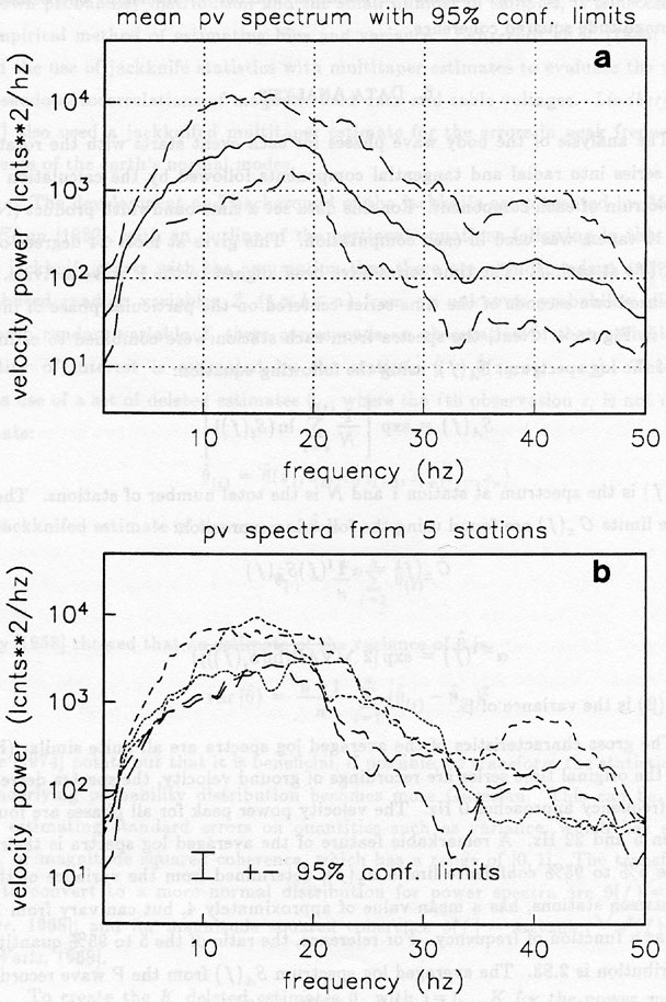
Figure 6
The data from station AZA is the common time series and the MSC estimates of the common series with each of the other stations' data are shown in each successive plot. The 95% confidence limits (short dashed lines) of the γ2(f) are plotted as well as the theoretical 95% confidence limit (for Gaussian data) that MSC ≠ 0 (dashed line).
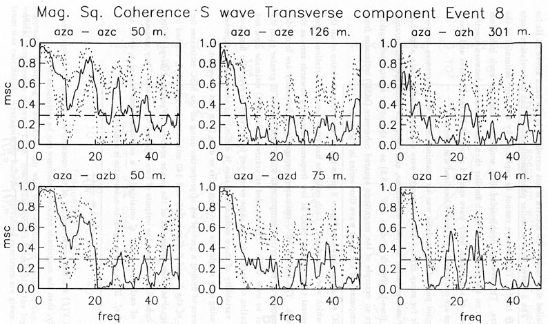
Figure 7
Contour plots of average magnitude squared coherence for the components of the P wave plotted against distance and frequency. Black signifies region where coherence has less than 95% confidence of being not equal to 0. The right side plots show the average signal to noise ratio for all event for each phase. All data where the signal to noise ratio σ 2 ≤ 20 was not used for the contour plots.
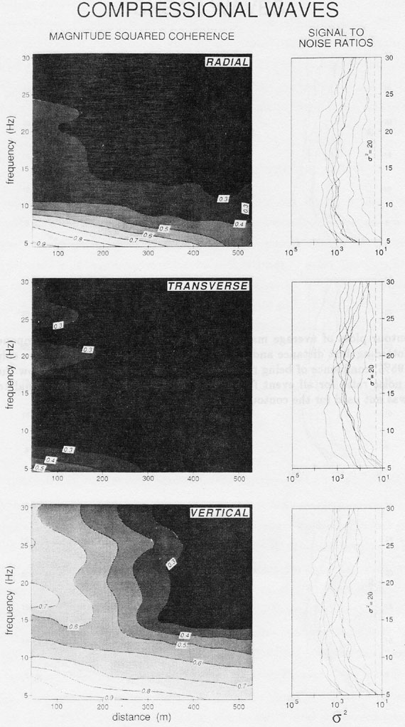
Figure 8
Contour plots of average magnitude squared coherence for the components of the S wave plotted against distance and frequency. Black signifies region where coherence has less than 95% confidence of being not equal to 0. The right side plots show the average signal to noise ratio for all event for each phase. All data where the signal to noise ratio σ 2 ≤ 20 was not used for the contour plots.
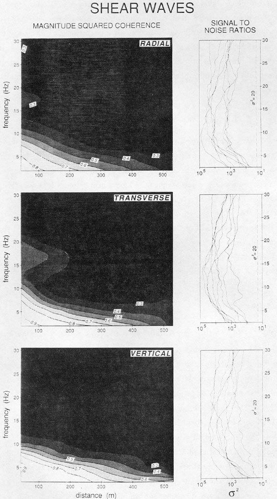
Figure 9
Displacement amplitude spectrum and the ± 95% confidence limits for station AZE, Event 8, from the transverse component of the S wave. The solid curve is the best fitting model using equation 7.1 where f c = 10 Hz, Ω 0 = 5.6 x 10⁻⁵cm-sec, N = 3.5. The point (Ω0 , fc ) is shown by the shaded triangle. The dashed curve uses equation 7.1 except the corner frequency is calculated by Snoke's method and N = 2. The point (Ω0 , fs) is marked with the filled circle.
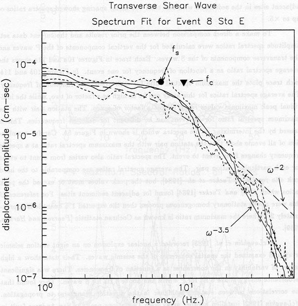
Figure 10
a. Average amplitude spectral ratios between all station pairs for each event on the P wave, vertical component.
b. Maximum amplitude spectral ratio at each frequency between any station pair for each event on the P wave, vertical component.
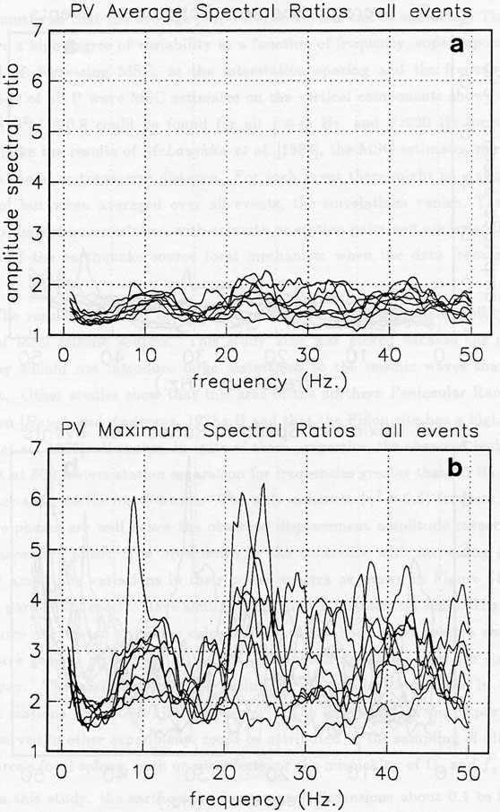
Figure 11
a. Average amplitude spectral ratios between all station pairs for each event on the S wave, vertical component.
b. Maximum amplitude spectral ratio at each frequency between any station pair for each event on the S wave, vertical component.
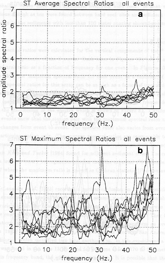
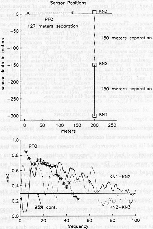
Figure 12
Comparison of the averaged magnitude squared coherence estimates between sets of sensors spaced approximately 150 meters apart. Three pairs of sensors are used, as shown in the top diagram, with two measurements in the vertical direction and one surface horizontal pair. The borehole sensors, KN1 and KN2 are placed at 300 and 150 meters depth, respectively, while KN3 is located on the surface. The selected PFO data used station pairs which are 127 meters apart. At least 10 events were used to form the average MSC for each pair of sensors. At frequencies above 30 Hz the coherence between KN1 and KN2 is much greater than the PFO surface values. The apparent holes in the MSC associated with KN1 and KN2 sensors is probably due to interference effects caused by the free surface reflection.